Within the complex field of User Experience (UX) design, our interactions with digital interfaces are shaped by some guiding principles. Together, these essential facts are referred to as the Laws of UX, and they act as guiding principles for creating intuitive and engaging designs.
Together, we will explore these ideas and see how they apply to the industry of creating seamless user experiences.
1. Law of Common Region

This law is concerned with the perception of connections among elements that are positioned in the same visual area. By grouping comparable items together, designers may enhance user understanding.
Core insights
- By organizing components into groups, users can better understand the connections between various components.
- To create a common region, just draw attention to items or groupings by enclosing them in a border.
- Give an element or group a backdrop definition to quickly create a common area and improve user understanding.
2. Law of Uniform Connectedness
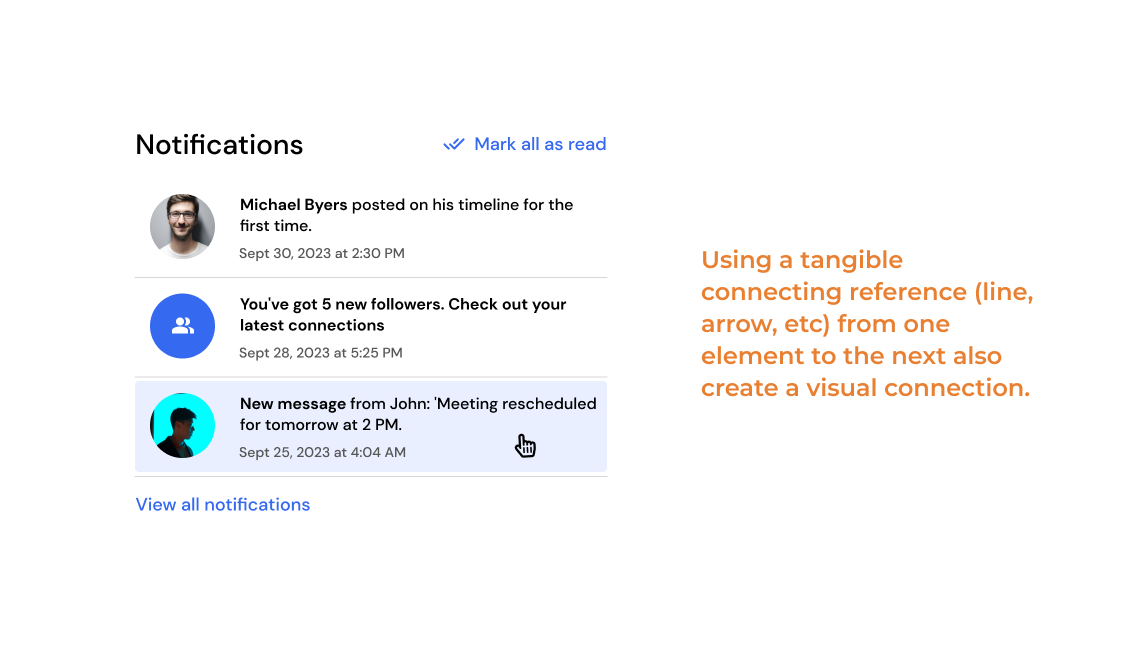
This law emphasizes how visually associated components are perceived as related. You may direct attention and improve user comprehension by using connections in your design.
Core insights
- By grouping related functions together using common colors, lines, frames, or forms, it can visually connect them.
- Use physical links between items, such as arrows or lines, to improve visual coherence.
- Use consistent connectivity to draw attention to links between related objects and to highlight context.
3. Tesler’s Law
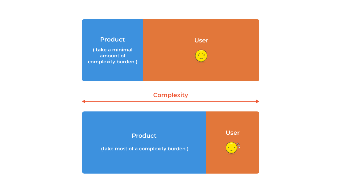
Irreducible complexity is a necessary component of all applications. The key is to keep things simple for users by shifting complexity from the user interface to the code or backend.
Core insights
- Complexity is a fundamental component of all processes, whether it is handled by the system or is accepted by the users.
- Move the complexity from the users to the system design to lighten their development burden.
- Maintain a balance between oversimplification and abstraction when it comes to interface design.
4. Occam’s Razor

Occam’s Razor asserts that the simplest option is frequently the best, which promotes simplicity. This indicates that in user experience (UX), simplicity of design should take precedence over needless complication.
Core insights
- The best approach to deal with complexity is to avoid it in the first place. Aim for design simplicity.
- Examine each component and remove as many as you can without compromising the overall functionality.
- According to the simplicity principle, the work is considered accomplished only when no more elements can be eliminated.
5. Von Restorff Effect
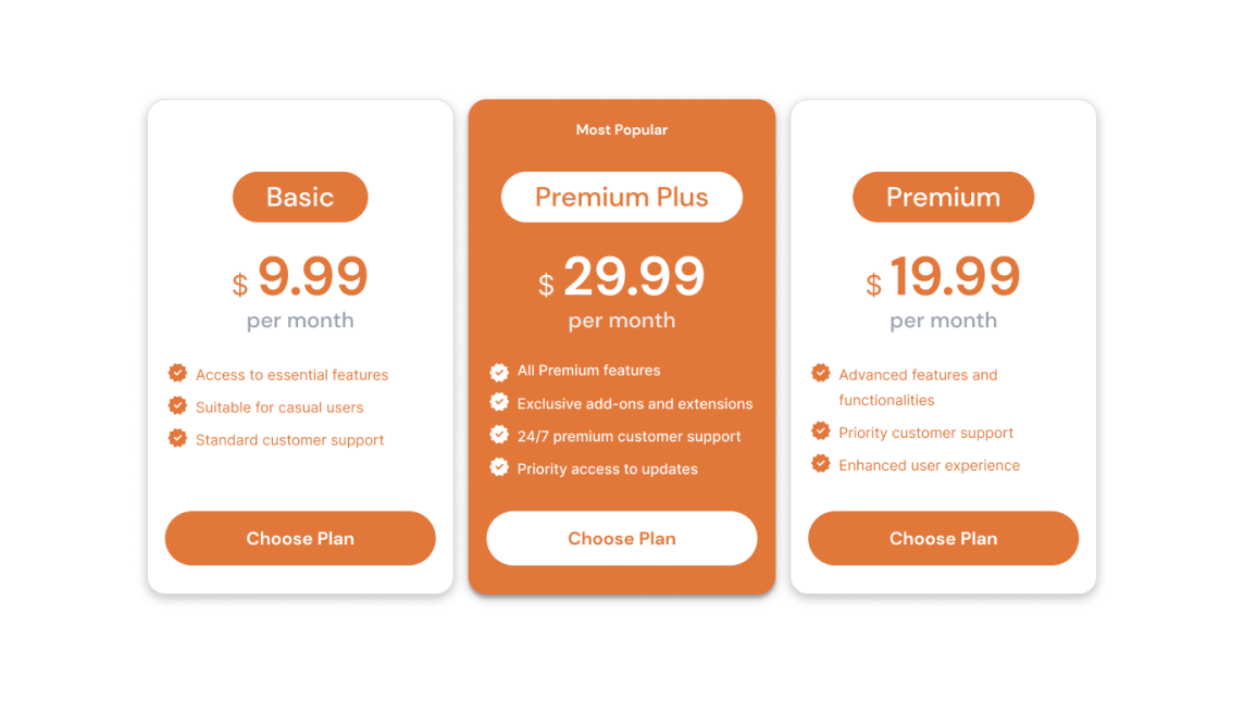
According to the Von Restorff Effect, items have a higher chance of being remembered if they stand out from their surroundings. This idea emphasizes the need of visual contrast in UX to draw users’ attention.
Core insights
- To ensure they stand out visually, highlight important information and activities.
- Be careful when drawing attention to components to avoid visual rivalry, especially when trying to stand out from advertisements.
- Don’t rely just on color to create contrast; take into account people who have low vision or color vision problems.
- To provide a user-friendly experience while employing motion for contrast, take into consideration users who are motion-sensitive.
6. Parkinson’s Law
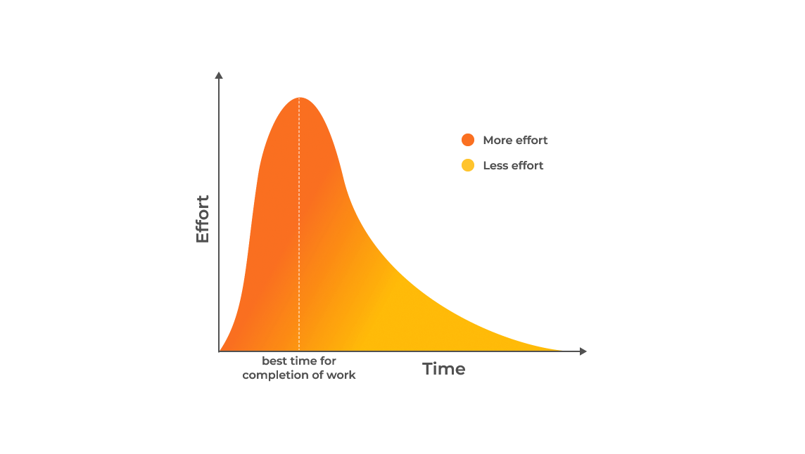
Parkinson’s Law emphasizes the idea that work increases to occupy available time. Setting reasonable deadlines is crucial to UX design in order to prevent needless delays and overcomplication.
Core insights
- To improve the user experience overall, match the job completion time to the user’s expectations.
- Reduce the difference between the task’s real and anticipated durations to increase user satisfaction.
- Increase productivity by utilizing tools that autofill forms to save time on purchases and reservations while avoiding task inflation.
7. Doherty Threshold

According to the Doherty Threshold, sometimes referred to as the “Golden Rule of Computation,” user satisfaction and efficiency increase with reducing response times. This law emphasizes how important it is for UX designers to optimize system reaction times.
Core insights
- Give users feedback to the system in 400 milliseconds or less to maintain their focus and improve performance.
- To decrease the impression of waiting and improve response time, use perceived performance.
- One way to keep users’ attention visually while loading or processing data in the background is through animation.
- Regardless of their accuracy, progress bars contribute to acceptable wait times.
- Even if the procedure itself takes far less time, purposefully applying a delay may increase the perceived value of the process and encourage trust.
8. Law of Prägnanz
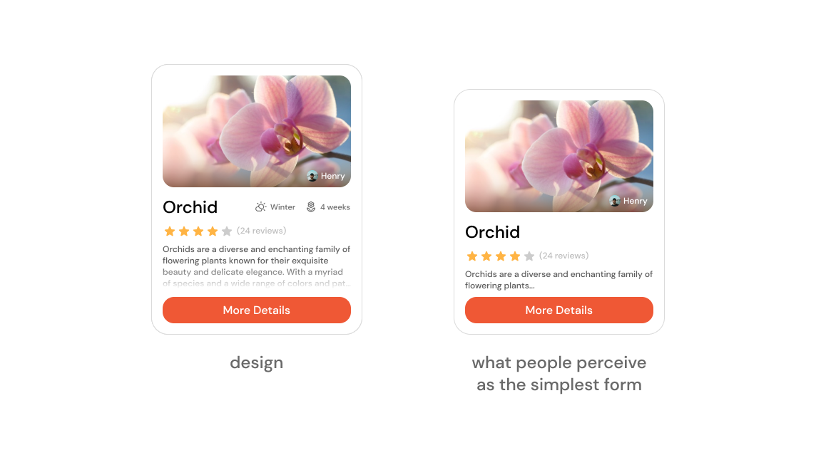
According to the law of Pragnanz, which is often referred to as the law of simplicity, users prefer the simplest, simplest interpretation of visual data. Designers should aim for simple and clear designs.
Core insights
- In complicated forms, our eyes automatically search toward simplicity and order to avoid information overload.
- Research shows that people understand and remember simple figures more easily than complicated ones.
- Complex shapes are perceived by the human eye as a single, connected form, which makes them easier to understand.
9. Law of Proximity
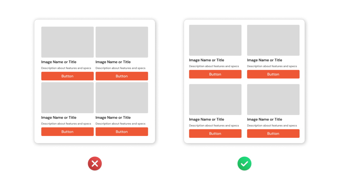
Elements that are close to one another are considered related. Use proximity to visually group objects in your design to provide a clear structure and easy navigation for users across the information.
Core insights
- Creating a relationship with nearby items can be helped by proximity.
- Things that are near together are thought to have comparable features or functions.
- Users are able to understand and arrange information more quickly and effectively when it is close at hand.
10. Law of Similarity
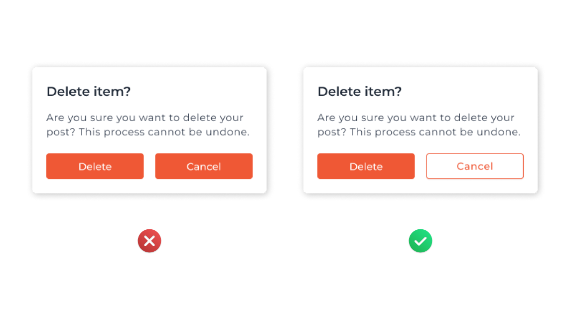
Element similarity in terms of color, shape, or size is seen as a connection. Use these visual signals to group elements together in a design so that they have a common meaning or purpose.
Core insights
- Similar-appearing elements are considered as related. Color, shape, size, orientation, and movement similarities indicate a common purpose or meaning.
- Visually group elements based on size, color, and shape to show similarities. This helps to communicate performing or meaning.
- Make sure that links and navigation are distinguished visually from ordinary text to provide a user-friendly interface.
11. Serial Position Effect

Users typically remember the beginning and final parts of a series more clearly than the middle ones, as demonstrated by the serial position effect. With this information, designers can create memorable beginnings and ends.
Core insights
- There is less memory interest on fewer significant items in the center of lists. This is consistent with these objects’ tendency to be less fully remembered in working and long-term memory.
- By utilizing the serial location effect and placing important actions at the far left and right of features like navigation, you could improve remembrance
12. Zeigarnik Effect

People remember interrupted or incomplete tasks more clearly than finished ones, as demonstrated by the Zeigarnik Effect. By employing signals to encourage users to complete tasks or actions, designers can use advantage of this.
Core insights
- Clearly marked hints of further material will motivate users to find it.
- It is more likely that users will be motivated to finish a work if they are given false progress towards their goal.
- Assist users in finishing tasks by giving them a clear indicator of their progress.
13. Peak-End Rule
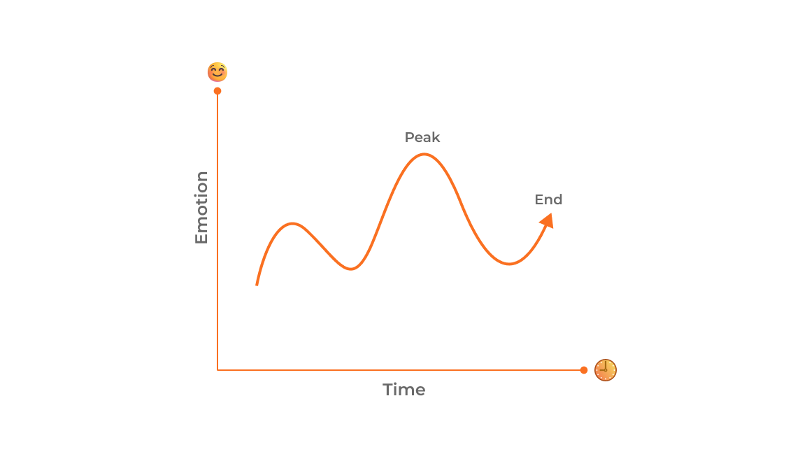
According to the peak-end rule, people remember experiences due to their peaks and ends. By making sure that peaks are remembered and conclusions are favorable, designers can maximize user experiences.
Core insights
- Give priority to the most intense and last parts of the client’s journey. Create for the user’s enjoyment during these significant moments.
- Find and improve the times when your product is most useful or enjoyable to use, resulting in a satisfying and unforgettable user experience.
- Understand that bad events are remembered more strongly than good ones. Make an effort to reduce unpleasant experiences in order to leave a lasting good impression.
14. Postel’s Law
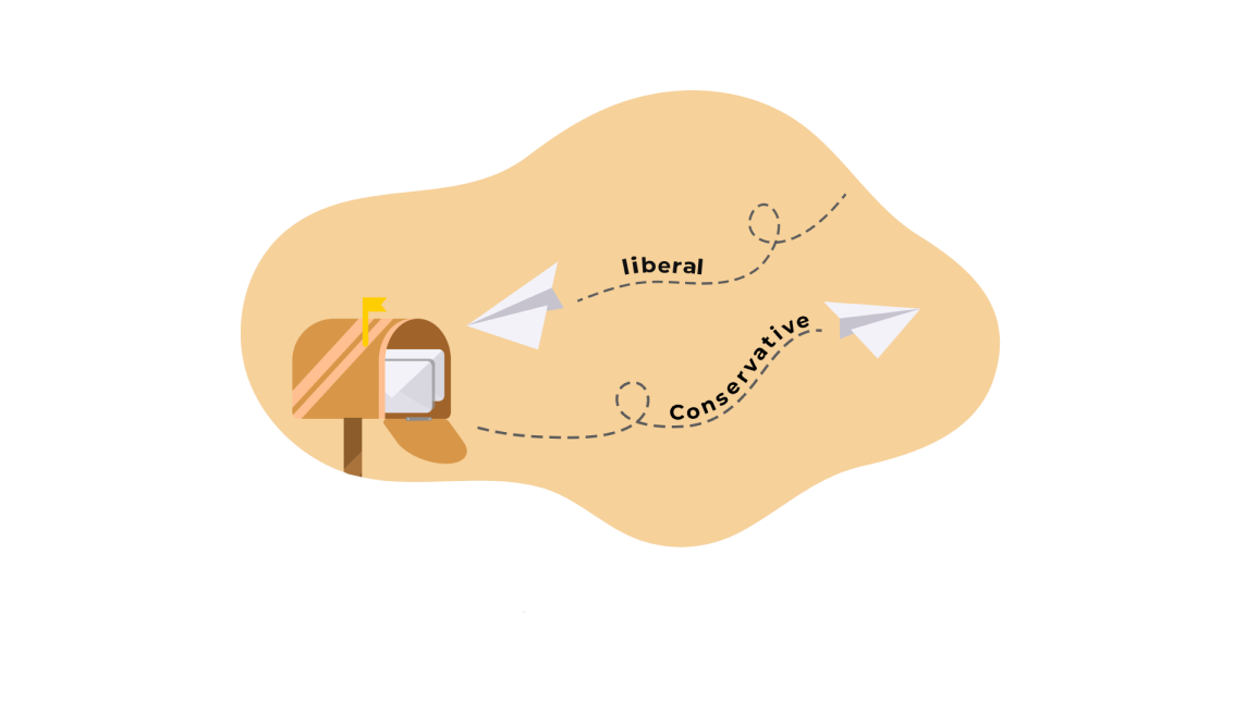
Systems should be conservative in what they engage and liberal in what they take, according to Postel’s Law, sometimes known as the robustness principle. In UX design, compatibility and dependability are important.
Core insights
- When designing, show empathy, adaptability, and tolerance for a range of user behaviors and inputs.
- Assume a broad variety of inputs, access, and capabilities to provide a dependable and user-friendly interface.
- To improve resilience, design with a variety of situations in mind, accounting for a range of user behaviors.
- For a smooth and user-friendly experience, accept different user input, interpret it to satisfy needs, establish distinct input boundaries, and seek user feedback.
15. Fitt’s Law
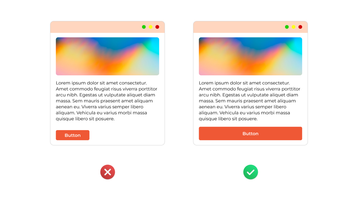
The size and distance of a target affect how easy it is to make a decision. The user experience can be improved by clicking or tapping on larger and closer things.
Core insights
- Make sure the touch targets in your design are large enough for accurate selection.
- To make it easier to use, provide enough space between touch targets.
- Touch targets should be placed in easily accessible regions to facilitate simple user acquisition.
16. Hick’s Law
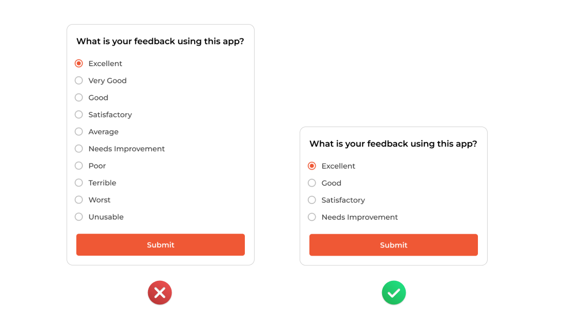
To keep people interested, simplify choices at critical points, split work into small portions, emphasize suggestions, conduct progressive onboarding, and avoid from oversimplification.
Core insights
- When there’s not much time to make a selection, choose fewer alternatives.
- Divide difficult activities into smaller sections to improve user understanding and reduce cognitive load.
- To avoid overwhelming users, highlight suggested options.
- To reduce inexperienced users’ cognitive stress, introduce features gradually.
- When simplifying, use caution to ensure that duties are still clear without becoming abstract.
17. Pareto Principle
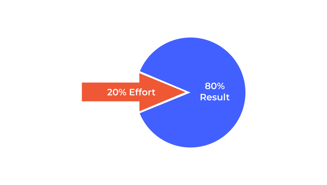
According to the Pareto Principle, around 20% of causes compose 80% of effects. This idea encourages UX designers to concentrate on the most essential elements that will significantly affect the user experience.
Core insights
- Recognize that in design, inputs and outcomes are frequently distributed unevenly.
- Recognize that in a big group, a small number of people may make a major contribution to the intended result.
- To have the most influence on the majority of users, focus your efforts on areas where there is the highest chance of success.
18. Jakob’s Law
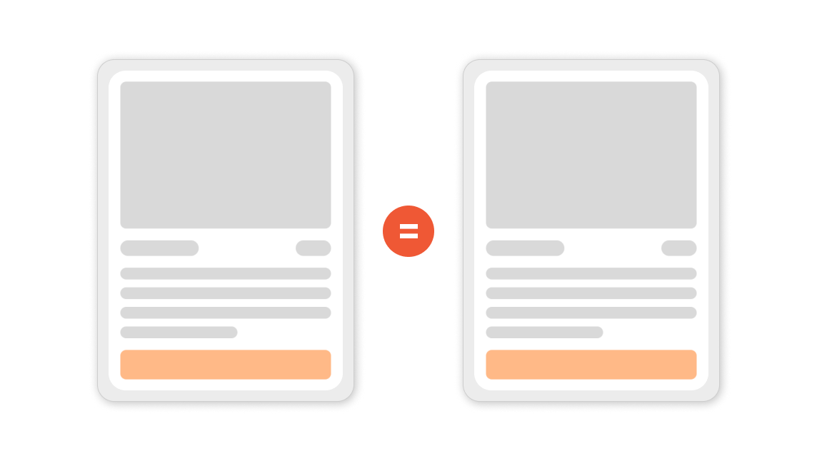
Users expect that a website’s features and layout will match what they have used on other websites. Following well-known patterns improves usability and offers a more natural user interface.
Core insights
- Users bring along their expectations from one well-known product to another that shares a similar look.
- For better user experiences, make advantage of pre-existing mental models, allowing up users to concentrate on tasks rather than picking up new ones.
- Reduce complexity during updates by allowing users to work with a recognizable version for a brief period of time.
19. Aesthetic Usability Effect

According to the aesthetic usability effect, users often feel that designs with higher visual appeal are more useful. It highlights the importance it is to combine aesthetic appeal with usefulness to create successful user experiences.
Core insights
- Positive responses are caused by visually appealing designs, which makes users think the design works better.
- Users are more accepting of small usability problems when a product has an attractive appearance.
- A visually appealing design can cover up usability issues, which might make it more difficult to find difficulties during usability testing.
20. Goal Gradient Effect

According to the goal gradient effect, people make more effort when they are getting closer to a goal. This impact may be used in UX to highlight accomplishments and progress to increase user motivation and engagement.
Core insights
- As the task nears completion, users accelerate their efforts, in line with the goal gradient effect.
- Providing false progress updates encourages users to finish activities.
- To improve work completion and encourage users, provide them a clear indicator of their progress.
Adhering to the Laws of UX is like using a compass to navigate the ever-changing world of digital design because it helps us stay on course even when trends and technology change.
As we get to the end of our study, let these ideas guide your future design initiatives. I hope your designs withstand the ever-changing digital waves, your users are pleased and your interfaces are simple to use. Have fun creating!
Inspired and referenced from Laws of UX
