In user interface design, buttons are a common element that are crucial for navigation and interaction. The way buttons are designed greatly influences the user experience on any digital platform, whether it a website, mobile app, or any digital platform. Every component, including its positioning, usefulness, and aesthetics, affects how well users interact with the interface. In this article, we will examine best practices for button design, going over important ideas and methods for making buttons that are aesthetically pleasing, easily navigable, and intuitive.
Enough Padding
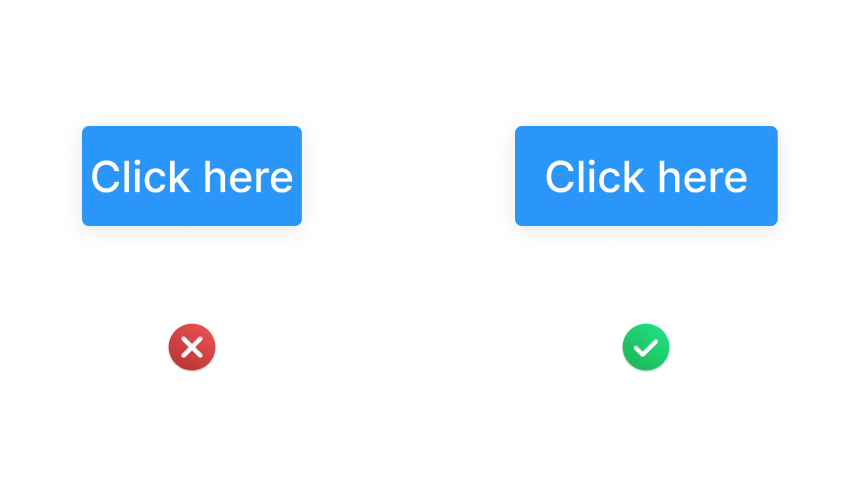
One of the most important UI/UX design principles is to leave enough space around your buttons. By strategically placing the button, users are less likely to accidentally tap the wrong one, which can cause frustration and mistakes. You can create an environment that is more user-friendly and conducive to precise and intentional interactions by making sure that buttons have adequate whitespace surrounding them. This is especially important to take into consideration with touch devices, because users’ fingers could unintentionally reach nearby elements. Therefore, you improve usability and contribute to a more seamless user experience by allowing buttons some breathing room.
Consistent Button Style
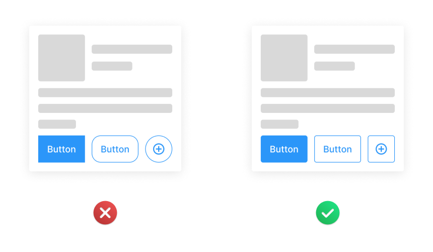
One fundamental button design aspect that cannot be emphasized enough is consistency. Users are able to navigate throughout various parts of your interface with simplicity and rapidity when all of the buttons have a consistent look. Users are able to develop mental models of the interface’s layout and function because of its uniformity, which encourages predictability and familiarity. Consequently, people are able quickly figure out the function of every button and carry out their intended actions with certainty. You can create a unified visual language that improves usability and reduces users’ cognitive stress by keeping button appearances consistent.
Highlight Key Action
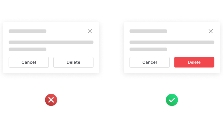
Using visual signals to prioritize and emphasize important activities inside the user interface is a key component of effective button design. This can be accomplished, for example, by using larger text sizes and contrasting colors for primary actions like “Delete” and “Submit.” These choices in design draw users’ attention toward significant tasks by highlighting crucial interactions. You can make an interface that is more user-centric and intuitive, which speeds up the user’s journey and increases completion rates, by utilizing visual hierarchy strategies. This purposeful focus on key tasks improves your application’s overall usability and makes for a more fulfilling user experience.
Readable Typefaces
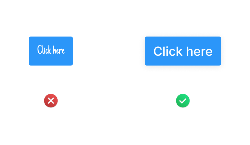
In order to make sure that users can rapidly understand and act upon the information offered, button text readability is crucial. When choosing fonts for button text, give readability and clarity priority above complex or highly decorative designs. Choosing typefaces with clean lines and sufficient spacing between characters improves legibility, especially in low-light or on smaller displays. You can make sure that users can easily interpret button labels and make informed decisions by selecting typefaces that strike a balance between readability and visual appeal. This focus on typography results in a clean and professional interface that gives users confidence and trust.
Enough Contrast
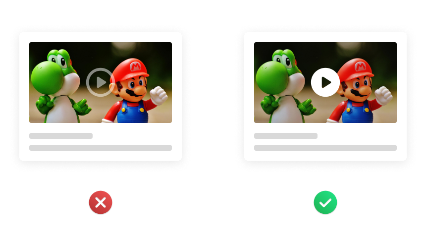
Improving button visibility is essential for supporting users with different visual preferences and abilities. Making sure there is enough contrast between the color of the button and its background is one useful technique. Because of the strong contrast, buttons are easier to recognize and use because they stick out against the background. To emphasize button affordances and enhance visual clarity, think about adding subtle visual cues like gradients or shadows. You may design buttons that are more inclusive and accessible, meeting a range of user needs and preferences, by giving visibility priority to them.
Sufficient Touch Zone
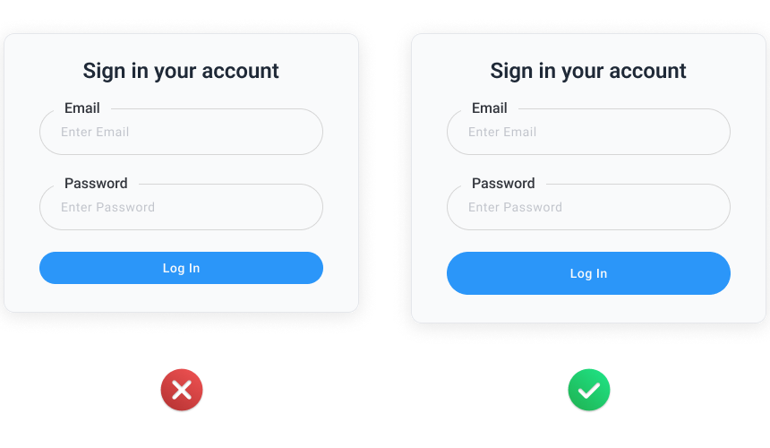
Button size affects usability directly, especially on touch-enabled devices where accuracy of interaction is important. It’s essential to make sure that buttons are appropriately large and tap-friendly in order to accommodate users’ natural finger movements and reduce the possibility of misclicks. Users can tap comfortably on a large enough surface area without worrying about accidentally hitting adjacent objects, thanks to the minimum recommended size of 48×48 pixels. Following these dimensions can help you design an interface that is easier to use and more ergonomic, allowing for smoother interactions across a range of devices and screen sizes. This user-centric method of button size improves overall user experience by improving usability.
Fixed Button Width for Mobile
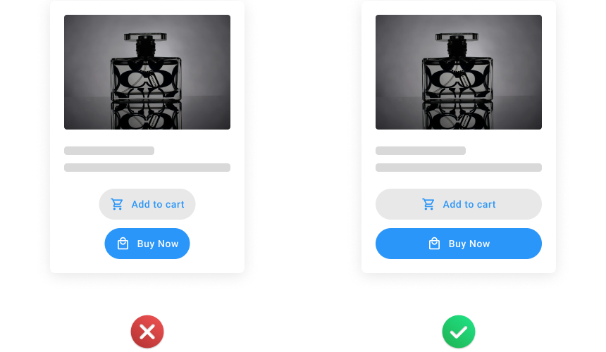
Button width consistency is a frequently disregarded UI/UX design aspect that can have a big impact on the user experience, especially on mobile interfaces with limited screen real estate. Consistent button widths across your interface help you prevent unexpected layout changes that can be confusing and interrupt users’ flow of navigation. Consistent button widths give users a visual reference point, enabling them to safely and reliably navigate the UI. A unified and harmonious layout improves usability and creates a smooth user experience across all touchpoints, regardless of whether users are engaging with buttons on desktop or mobile devices.
The usability and aesthetics of your interfaces can be improved, which will result in a more satisfying user experience, by following the best practices described in this blog. Always prioritize accessibility, consistency, and clarity in your button designs, and make sure they fit the project’s broader design language and objectives. You can make buttons for your digital products that not only look fantastic but also improve their usability and functionality with thoughtful design and attention to detail.
